Color Effects Tool Guide: Apply Filters and Color Grading to PDFs
Learn how to apply grayscale, sepia, invert, brightness, contrast, and other color effects to PDF pages using pdfpress.app's browser-based Color Effects tool.
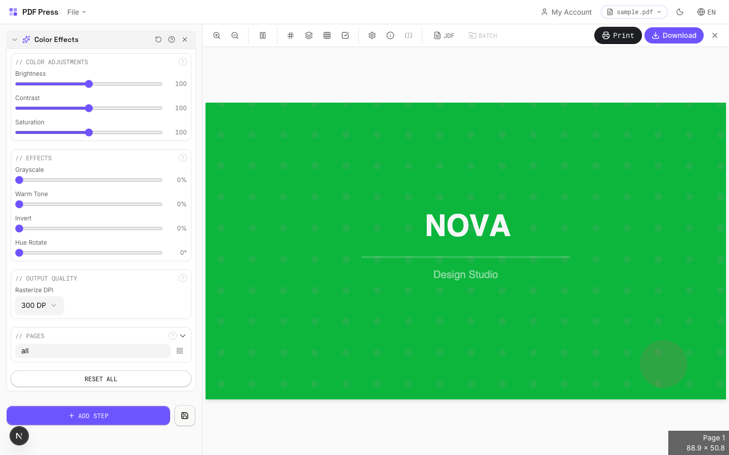
What the Color Effects Tool Does
The Color Effects tool in pdfpress.app applies visual filters and color transformations to PDF pages — similar to the adjustment layers you might use in Photoshop, but applied directly to an entire PDF document. Whether you need to convert a full-color brochure to grayscale for a black-and-white print run, add a warm sepia tone for an archival look, or adjust brightness and contrast for better legibility, this tool handles it all within the browser.
Unlike raster-only editors, pdfpress.app's Color Effects tool works at the PDF rendering level, applying transformations to the page content stream. The result is a new PDF with the color effects baked in — ready for print, proof, or digital distribution. All processing happens locally via WebAssembly, so your files never leave your machine.
Available Color Filters and Adjustments
pdfpress.app offers a comprehensive set of color effects that cover the most common prepress and production needs:
- Grayscale: Converts all page content to shades of grey. Essential for black-and-white print runs, newspaper ads, or reducing printing costs by eliminating color plates.
- Sepia: Applies a warm brownish tone that mimics aged or vintage documents. Popular for certificates, historical reproductions, and decorative prints.
- Invert: Reverses all colors on the page — black becomes white, white becomes black, and all intermediate colors swap to their complementary values. Useful for creating negative proofs or artistic effects.
- Brightness: Increases or decreases the overall lightness of the page. Raising brightness can compensate for dark images that will appear muddy on uncoated paper stocks.
- Contrast: Adjusts the difference between the lightest and darkest areas. Higher contrast makes text sharper and images more punchy; lower contrast softens the overall appearance.
- Saturation: Controls color intensity. Desaturating moves colors toward grey; increasing saturation makes them more vivid. Useful for tuning vibrance before a print run.
- Hue Rotation: Shifts all colors around the color wheel by a specified number of degrees. A 180° rotation inverts the color spectrum while preserving luminance relationships.
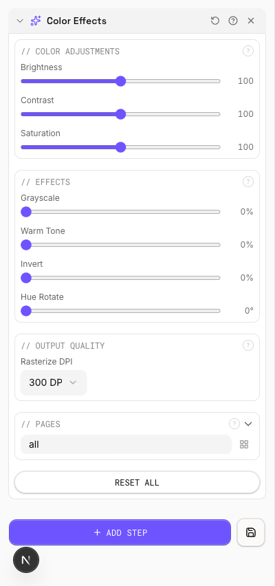
Each filter can be applied independently or in combination. For example, you might apply a slight brightness boost along with increased contrast to prepare a document for printing on newsprint, where dot gain typically darkens the output.
Step-by-Step: Applying Color Effects in pdfpress.app
Applying color effects to your PDF takes just a few clicks:
- Load your PDF: Open pdfpress.app and drag your document into the browser window.
- Select the Color Effects tool: Find "Color Effects" in the tool sidebar. The configuration panel opens with all available filters.
- Choose your filter(s): Select the effect you want to apply. For a simple grayscale conversion, toggle "Grayscale" on. For more nuanced adjustments, use the brightness, contrast, and saturation sliders.
- Adjust intensity: Each slider provides real-time control. Move the brightness slider to +20 to lighten, or -20 to darken. The preview updates instantly.
- Preview the result: The live preview shows exactly how every page will look with the applied effects. Scroll through multi-page documents to verify consistency.
- Export: Click "Export" to generate the processed PDF. The color effects are permanently applied to the output file.
Because all processing runs locally via WebAssembly, even large multi-page documents process quickly without the latency of cloud-based tools.
Use Case: Grayscale Proofing for Black-and-White Print
One of the most practical applications of the Color Effects tool is converting a color document to grayscale for proofing purposes. Before committing to a black-and-white print run, designers need to verify that their color design translates well to shades of grey.
Common problems that grayscale proofing reveals include:
- Insufficient contrast: Two colors that look distinct in full color (e.g., red and green) may become nearly identical grey values, making text or charts unreadable.
- Lost visual hierarchy: Color-coded elements (headers, callouts, pull quotes) may lose their visual distinction in grayscale.
- Image quality issues: Photographs that rely on color contrast for impact may appear flat or muddled without color.
By running your PDF through the Grayscale filter in pdfpress.app, you can identify and fix these issues before sending to print — saving time, materials, and money.
Use Case: Artistic Effects for Specialty Printing
Beyond functional proofing, the Color Effects tool enables creative transformations for specialty print products:
- Vintage certificates: Apply a sepia filter to give awards, diplomas, or commemorative documents an aged, distinguished appearance without redesigning the original file.
- High-contrast posters: Boost contrast and saturation to create bold, eye-catching event posters optimized for large-format printing.
- Negative art prints: Use the Invert filter to create striking negative-image artwork. This is also useful for screen printing where the stencil requires an inverted image.
- Muted editorial layouts: Reduce saturation slightly to achieve the desaturated, editorial aesthetic popular in high-end magazine and book design.
These effects can be applied to finished PDFs, meaning you don't need access to the original design files. This makes the Color Effects tool invaluable for print shops that receive ready-made PDFs from clients and need to adjust the visual treatment for a specific print application.
Use Case: Improving Accessibility and Readability
Color effects can significantly improve the readability and accessibility of PDF documents:
- High contrast for low vision: Boosting contrast makes text easier to read for people with reduced visual acuity. A +30% contrast increase can dramatically improve legibility on printed materials.
- Inverted colors for screen readers: Some readers prefer light text on dark backgrounds. The Invert filter provides a quick way to produce an alternative version of a document for digital distribution.
- Brightness compensation: Documents printed on tinted or dark paper stocks may need a brightness boost to maintain readability. The brightness slider lets you compensate before printing.
For organizations producing large-print or accessible versions of their documents, the Color Effects tool provides a fast, non-destructive way to generate alternate versions from a single source PDF.
Combining Color Effects with Other pdfpress.app Tools
The Color Effects tool integrates naturally into a broader pdfpress.app production workflow:
- Color Effects → Prepress: Apply grayscale conversion first, then use the Grid or Booklet tool to impose pages for a black-and-white print run. This ensures the grayscale conversion is verified before layout.
- Color Effects → Preflight: After applying effects, run the Preflight panel to verify that image resolution and fonts are still intact. Color transformations should not degrade these, but verification is always best practice.
- Color Effects → Overlay: Apply a sepia tone to your document, then use the Overlay tool to add modern printer marks on top. This creates an interesting contrast between the vintage content and crisp technical marks.
- Backdrop → Color Effects: Use the Backdrop tool to add a background, then apply brightness or contrast adjustments to the combined result for final tuning.
Because pdfpress.app's tools are composable, you can chain multiple operations in sequence. Each step produces a valid PDF that feeds cleanly into the next tool.
Technical Considerations and Limitations
While the Color Effects tool is powerful, understanding its technical characteristics will help you use it effectively:
- Rendering-level transformation: Color effects are applied at the rendering level of the PDF. This means the visual appearance changes, but the underlying PDF structure (fonts, vectors, metadata) remains intact.
- Spot color handling: When converting to grayscale, spot colors (Pantone, etc.) are converted to their nearest grey equivalent. If you need to preserve spot color separations, apply the grayscale filter only to the process-color layers in your source application.
- ICC profile interaction: Color effects are applied after any embedded ICC profile transformations. For precise color management, consider using pdfpress.app's dedicated Color Management tool for ICC-based conversions, and reserve Color Effects for visual adjustments.
- Non-destructive workflow: The original uploaded PDF is never modified. Color Effects always generates a new output file, so you can experiment freely without risk.
For production-critical color conversions (e.g., RGB to CMYK with a specific ICC profile), use the Color Management tool instead. The Color Effects tool is optimized for visual filtering and creative adjustments rather than device-level color space transformations.
Try it yourself
PDF Press runs entirely in your browser. Upload a PDF, pick a tool, and download the result — fast and private.
Open PDF Press22 Professional Imposition Tools
Every tool runs locally in your browser — fast, private, and professional-grade.
Frequently Asked Questions
Related Articles
Ready to try professional PDF imposition?
PDF Press is a browser-based imposition tool with 22 professional tools. No installation required.
Open PDF Press